

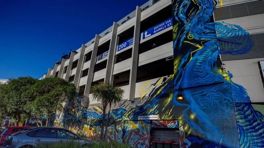
Fresh Hood | Preston Markets
The project was titled Fresh Hood, a play on words changing fresh food to cool suburb with one letter. When I was told that Cam Scale and I would be collaborating on a piece on the same wall as Dvate and Sabath I knew that we needed to do something nice.
The Preston Market upgrade ‘Fresh Hood’ organized by The Space Agency.
The agency activates underutilised spaces such as main streets, shopping centres and open areas. A group of artists was selected and asked to come and add some interest to the walls of the old bingo hall that was to house the food stalls, live music and shops. This aspect of the project was curated by Dean Sunshine.
The project was titled Fresh Hood, a play on words changing fresh food to cool suburb with one letter. When I was told that Cam Scale and I would be collaborating on a piece on the same wall as Dvate and Sabath I knew that we needed to do something nice. Dvate and Sabath have both been painting for years but it is in recent times that they have been doing some particularly sharp, detailed and very impressive photorealistic murals on a large scale.
We divided the wall in half and Dvate and Sab let me know what colours they were using and a rough idea of what they were thinking of painting. This helped us choose colours that would work well together. We decided to leave quite a bit of negative space so as to avoid crowding their work.
Cam had an exhibition of his portrait work on canvas coming up, so I suggested that we use this opportunity to paint something that related to the work in his show. His show consisted of portraits of graffiti artists, street artists, art collectors, graffiti cleaners and the like. The paintings depicting the graffiti/street artists all had part of the artist’s face obscured and some artwork done by the artists’ hand. Their faces were partially hiddento highlight the fact that most of these people are known for their art, their personal image is often unknown.
We started painting early June 14th. Conrad is good to paint with; a hard worker who understands what needs to be done and gets to it. We both worked simultaneously on sections of the wall stopping occasionally to discuss the progress.
Cam liked this idea and decided that since I was to be painting the piece with him, he may as well do a portrait of me. I found this idea amusing and somewhat narcissistic but I can be both of those things at times, so why not? It’s not often that your likeness gets captured by the hand of an artist and he had done a portrait of me for the show so we knew what needed to be done.
I wrapped a bandana around my face and donned a cap, like a writer in the night about to bolt cut his way into a train yard. The cap and bandana served as my canvas. My image was to be partially hidden by my strange somewhat Gigeresque style signature. I chose nice bright warm colours to jump off the charcoal background. I knew Cams’ colour palette would be controlled and subdued. I picked the purples, yellows and oranges to complement the browns and purples of the skin tones and contrast the dark basecoat. I brought a bucket of Dulux chrome with me as I thought that the background would be good to paint with a moon shining high in the sky.
We let elements of graffiti art creep into the design. I mean, it’s a portrait of a graffiti artist right? The hoody is made up of layered tags. The face looks ahead as though the tags are in the past and something new is on the horizon.
When we painted the moon we let it drip. More of a homage to having our roots deeply entwined in the graffiti world.
The moon plays a few roles on this wall. It works as a light source giving a cool glow to the face of the artist. It helps balance the composition and it looks like a giant mop marker or shoe polish filled with chrome has been stamped on the wall. As though prepping the marker, flooding the nozzle with paint before dropping a tag.
Cam and I were pleased with the result so much that I thought the moon could do with a few stars.
The star is another recurring motif in graffiti, often used to punctuate the stylised tag.
The moon was so bold and effective, that we decided one massive star done to the same proportions as the moon would be the best way to balance this. As though it was done with a few strokes from the same marker or fat cap. Almost as though the artist portrayed painted them on the wall.
Many other artists were involved in painting up various other walls; Mayo, Putos, Shame, Duke, Heesco, Mike 11 and more.
The collaboration between Cam and I was done completed over two days; May 16-17; 2016.
“I wrapped a bandana around my face and donned a cap, like a writer in the night about to bolt cut his way into a train yard.”

Fresh Hood | Image captured by p1xels

Overspray | Album Art
I had a few hair brained plans about the title and artwork for the album cover. It was Retainer who said we need to keep it simple. The words Over Spray had been tossed around and he suggested it as the title. It was perfect

I had a few hair brained plans about the title and artwork for the album cover. It was Retainer who said we need to keep it simple. The words Over Spray had been tossed around and he suggested it as the title. It was perfect - because when you're painting you get over spray on everything. It’s also another way of saying that we were over spray painting. At least until we got the album done.
It’s as if we are saying our graffiti art has tainted this music; the dust of our artwork has settled onto the beats.
It actually it has many meanings; the music is the bi-product of our lifestyles, it is the over spray not the main work itself, it also implies imperfection. As we'd settled on the title, the idea came to me to have a spray can on the front. I thought it would be interesting to make it look like an x-ray shot, so you could see the guts of the can. The brain behind the artwork, the inner workings. I thought we could have two colours of paint inside, separate, fighting for space. Yet when the nozzle of the can is pressed only one colour will come out. This represents the two artists; blue Bailer, red Retainer. Each bringing their own style to the project but working together to create one sound. The red and blue colours could be used again and again. I had a photographer take the shots of the spray can sitting on black perspex and the ink and nozzles. Then I put it all together in photoshop.
The colours are just food dye dripped into a glass of swirling water. I love this image.
Mural | Ballarat
This is a mural collaboration by Michael Porter, myself and a group of young people from the local Youth Group. These kids are Ballarat locals who showed interest in painting. They were selected by the youth services from the Ballarat Council.

This is a mural collaboration by Michael Porter, myself and a group of young people from the local Youth Group. These kids are Ballarat locals who showed interest in painting. They were selected by the youth services from the Ballarat Council and Mic and I ran a few sessions where we taught them drawing and painting techniques. We also showed them how to process their ideas - from brainstorming and formulating to realising a finished piece. I love this type of work and am grateful for the opportunity to work with young people in our communities.
The finished mural represents a strange landscape, painted in warm ochre colours, made up of faces. The young people helped us come up with a design that represented the area, and then they helped us paint. The warmth of the landscape is juxtaposed with the cool colours and strange alien/serpent-like blue form in the foreground.

Mural | Ripponlea
This wall used to have some really classic 80's graffiti on it - Dream and a few others. In the late 90's it got capped, so some friends and I repainted the whole thing. I

Ripponlea | Image captured by p1xels
This wall used to have some really classic 80's graffiti on it - Dream and a few others. In the late 90's it got capped, so some friends and I repainted the whole thing. I've painted it again a few times and had been meaning to redo it for a long time since. I finally got around to it. I was walking past and had a chat to the owner who told me he was thinking the same thing. So the timing was perfect.
This time I wanted to use the space properly and paint it on my own.
Continuing on the abstraction of the graffiti form without lettering. Like a giant alien tentacle made from arrows and elements pulled from a graffiti piece.
I should have kept the painting to black, blue and red. I got carried away and added a few more colours. I think it still works but not quite as well. Sometimes it's hard to stop when you should.

Lean On Me | St. Kilda
The seats out the front of Pablo Honey were looking rather drab and weathered. They asked me to brighten them up with some of my art. The spaces that needed to be painted were all strange shapes not suited to one large image.

Lean on Me | Image captured by p1xels
The seats out the front of Pablo Honey were looking rather drab and weathered. They asked me to brighten them up with some of my art. The spaces that needed to be painted were all strange shapes not suited to one large image. I decided to paint a pattern of graffiti elements on a black background. The biomechanical shapes in the artwork all denote movement. It's as though the arrows from a graffiti piece have broken free and are swimming through space.
Acland Court | St. Kilda
This one was a biggie. We got The City of Port Phillip on board to fund the project, the Body Corporate helped with the scissor lifts and Haymes Paints donated a whole lot of really good quality paints.
This one was a biggie. We got The City of Port Phillip on board to fund the project, the Body Corporate helped with the scissor lifts and Haymes Paints donated a whole lot of really good quality paints. The space is an unloved dingy alleyway that stinks of chicken fat from the Safeway cooker. It's littered with needles and the odd angry junky, sex workers working the corner at night and was absolutely hammered with graffiti and pigeon shit.
The traders/body corp and council wanted something to make the lane more inviting and stop graffiti. I was personally of the belief that the space already belonged to the graffiti artists. They were the only ones showing it love by painting their names on it. Instead of taking this space from them and creating some lovely, cheesy, vomit inducing community mural. We managed somehow to convince all parties involved that the artists needed some creative freedom. The outcome is one of my favourite murals.
“We managed to convince all parties involved that the artists needed some creative freedom. The outcome is one of my favourite murals.”
Mic Porter did an amazing job turning a huge section of the wall into a crazy totem of sorts, Conrad Bizjak did some cubist styled surrealist sexual expressionism (probably a few other isms as well), Cam Scale painted himself painting his piece, and I painted a huge glowing graffiti creature, charging up the wall. There were 10 or so local graffiti artists who painted the length of the wall as well. Best go check it out.
I chose black as the back ground as we needed to brighten up the lane. This may seem counterintuitive but all colours pop when painted on black. It brings the brightness right out at you. I really dug this mural. Painting for a few days in the sun with good people. This is the perfect example that given freedom and trust, artists will produce the best outcome. I mean you don't get an electrician to your house to fix the wiring then tell him how to cut the wires do you?

Sunroof | South Melbourne Markets
The South Melbourne Market have been supporting local artists for many years now. They feature lots of walls in and around the market painted by many different artists. To help celebrate the 150 year anniversary of the market, three artists; Cam Scale, Knock and myself where commissioned to add some new works to brighten up a few spaces.

Sunroof | Image captured by p1xels
The South Melbourne Market have been supporting local artists for many years now. They feature lots of walls in and around the market painted by many different artists. To help celebrate the 150 year anniversary of the market, three artists; Cam Scale, Knock and myself where commissioned to add some new works to brighten up a few spaces.
I thought it would be a great idea to paint the ceiling above the stairs at the entrance of the market. Visions of the sistine chapel came to mind as I gazed upwards.
The walls and ceiling are corrugated tin with many beams and pipes to paint over. This meant that painting something intricate in the 2 days allocated was out of the question. The space was also extremely hard to access. I squeezed a massive boom lift into the space at the bottom of the stairs then carefully manoeuvred my self into position.
I have to thank the good people at the market for being so nice to me even after I managed to knock over a tin of paint with the boom. The bright colours definitely add a lot of warmth to the entrance. I thought the many windows gave the space the appearance of a greenhouse, hence the vines.

Tryptamine | Scott Selkirk Collaboration
This piece is a collaboration with the artist Scott Selkirk. It was completed in December, 2016. I met Scott at the old Blender Studios in Melbourne CBD. Scott had a space close to mine. He's a great sculptor who puts many hours into his detailed pieces. While we were at Blender Studios,

Tryptamine | Scott Selkirk collaboration
This piece is a collaboration with the artist Scott Selkirk. It was completed in December, 2016.
I met Scott at the old Blender Studios in Melbourne CBD. Scott had a space close to mine. He's a great sculptor who puts many hours into his detailed pieces. While we were at Blender Studios, we spoke a few times about collaborating on something. It was a few years since I moved to another studio and I hadn’t seen Scott in a while, so I was happy to get a call from him about working together on something.
Scott had glued together a few layers of MDF then carved out a sculpture with a router. He spent hours sanding it smooth and coating it. When he dropped it off it was white. He gave me free reign to add colour however I wanted. I tried to use contrasting colours to help accentuate the curves, dips and rises in the organic shapes. The flow of the sculpture has similarities to parts of my painting style. I found it very fun to paint. I used One Shot enamel sign writing paint. It's so thick and shiny that it gave an almost plastic appearance to the sculpture.
This piece is currently hanging in Scott's studio. If you are interested in purchasing please contact me.

Floating | Dandenong Road
Roughly 40 meters long this piece was commissioned by VicRoads to help brighten an ugly stretch of wall space. Located where Dandenong road crosses the Sandringham train line, near the corner of Chapel street.
Floating | Image captured by p1xels
Roughly 40 meters long, this piece was commissioned by VicRoads to help brighten an ugly stretch of wall space. Located where Dandenong road crosses the Sandringham train line, near the corner of Chapel street.
The concept of the design grew naturally from humble beginnings. This space was a battle ground between graffiti bombers and graffiti cleaners. They would paint it grey then wait for it to get trashed and repeat. As the wall was such a popular canvas for graffiti writers, I thought the best direction to take would be to paint some intricate graffiti pieces. I proposed the idea to Vic Roads that I would select several prominent graffiti artists who were prolific in the area and that together we would paint graffiti pieces from one end to the other. Whilst they liked this concept, they were not yet ready to hand control over to the very artists they had been locked in a battle for space with. They were more interested in getting a single piece of artwork that spanned the length of the wall with continuity of style. To their credit, they gave me a lot of artistic freedom and I really enjoyed painting this piece.
I painted it on my own over a few days. This piece is about movement. The strange dance a graffiti artist performs while standing alone with a brick wall as the audience. Strange glowing forms, that softly float yet aggressively plunge through space at the same time. I have been told by many people that they see dragons in the shapes.

Sinch Station | Balaclava
When the opportunity for an artist to receive a Port Phillip Council grant to paint the 7/11 wall at Balaclava Train Station had been brought to my attention, I instantly thought of my good friend Michael Porter. Mic is one of my favourite artists and a Balaclava local.
Sinch Station | Image captured by p1xels
The opportunity for an artist to receive a Port Phillip Council grant to paint the 7/11 wall at Balaclava Train Station had been brought to my attention. I instantly thought of my good friend Michael Porter. Mic is one of my favourite artists and a Balaclava local. His distinctive style popped up all over Melbourne while he was active in the street art scene. We painted together many times in the early 2000's. Mic started as a typical graffiti bomber like many of the young people in and around St. Kilda. The scene was not a healthy one though, and after a few incidents he pulled back and concentrated on fine art studies at VCA. He developed his own unique style and painted it all over, using found objects and paint collected from hard rubbish. Mic has painted so many amazing pieces in strange and forgotten spaces. I thought it would be perfect for him to paint the wall right at the station to really showcase his talent.
Mic's brother Jordan died at this very station atop a train. His tag “Sinch" is boldly emblazoned on the wall. I felt that this wall needed to be painted by Michael as part of the grieving process and to pay homage to his brother. We focused the design on retaining the Sinch tag and using it as a central feature. The wall depicts a landscape made up of faces with storm clouds rolling in.
“We unfolded the drop sheet and spread it next to the wall and a whole gang of red back spiders scurried out.”
I love Michael's sketchy, painterly style but sometimes the details can get lost in the mottled colours that he uses. I decided to completely control the colour palette and force him to use a really strong graphic combination. He was so eager to get started that he began painting the day before we were meant to begin. I got to the wall and he had begun free-styling - a different work to the design that I had submitted that got us the grant. It was brown and grey and ugly. I could see the nice line work in it, but to someone who doesn't paint it would just look like crazy scrawling. I told him it was good practice but now he had to get stuck into the real thing. We painted for a few days. On day three I placed some drop sheets along the base of the wall. They didn't quite cover the whole length. Mic said not to worry he knew where there was a massive drop sheet then disappeared. He emerged dragging a massive drop sheet that had been alongside the train track for years.
We unfolded the drop sheet and spread it next to the wall and a whole gang of red back spiders scurried out.
"Are you trying to get me bitten again?" I blurted out. I'd been bitten on the leg at the start of the year and didn't want to repeat the experience. Next minute I'm dizzy, my shoulder hurts, my finger is swollen and there is a red line up my arm. Long story short, I had to go to hospital and get my painting finger cut open from knuckle to knuckle and have a sizeable amount of finger removed. Needless to say Mic finished the wall without me.
I have since got him involved in a few other projects and hope to continue to do so as he is an amazing artist.