

Sunroof | South Melbourne Markets
The South Melbourne Market have been supporting local artists for many years now. They feature lots of walls in and around the market painted by many different artists. To help celebrate the 150 year anniversary of the market, three artists; Cam Scale, Knock and myself where commissioned to add some new works to brighten up a few spaces.

Sunroof | Image captured by p1xels
The South Melbourne Market have been supporting local artists for many years now. They feature lots of walls in and around the market painted by many different artists. To help celebrate the 150 year anniversary of the market, three artists; Cam Scale, Knock and myself where commissioned to add some new works to brighten up a few spaces.
I thought it would be a great idea to paint the ceiling above the stairs at the entrance of the market. Visions of the sistine chapel came to mind as I gazed upwards.
The walls and ceiling are corrugated tin with many beams and pipes to paint over. This meant that painting something intricate in the 2 days allocated was out of the question. The space was also extremely hard to access. I squeezed a massive boom lift into the space at the bottom of the stairs then carefully manoeuvred my self into position.
I have to thank the good people at the market for being so nice to me even after I managed to knock over a tin of paint with the boom. The bright colours definitely add a lot of warmth to the entrance. I thought the many windows gave the space the appearance of a greenhouse, hence the vines.

Tryptamine | Scott Selkirk Collaboration
This piece is a collaboration with the artist Scott Selkirk. It was completed in December, 2016. I met Scott at the old Blender Studios in Melbourne CBD. Scott had a space close to mine. He's a great sculptor who puts many hours into his detailed pieces. While we were at Blender Studios,

Tryptamine | Scott Selkirk collaboration
This piece is a collaboration with the artist Scott Selkirk. It was completed in December, 2016.
I met Scott at the old Blender Studios in Melbourne CBD. Scott had a space close to mine. He's a great sculptor who puts many hours into his detailed pieces. While we were at Blender Studios, we spoke a few times about collaborating on something. It was a few years since I moved to another studio and I hadn’t seen Scott in a while, so I was happy to get a call from him about working together on something.
Scott had glued together a few layers of MDF then carved out a sculpture with a router. He spent hours sanding it smooth and coating it. When he dropped it off it was white. He gave me free reign to add colour however I wanted. I tried to use contrasting colours to help accentuate the curves, dips and rises in the organic shapes. The flow of the sculpture has similarities to parts of my painting style. I found it very fun to paint. I used One Shot enamel sign writing paint. It's so thick and shiny that it gave an almost plastic appearance to the sculpture.
This piece is currently hanging in Scott's studio. If you are interested in purchasing please contact me.

Floating | Dandenong Road
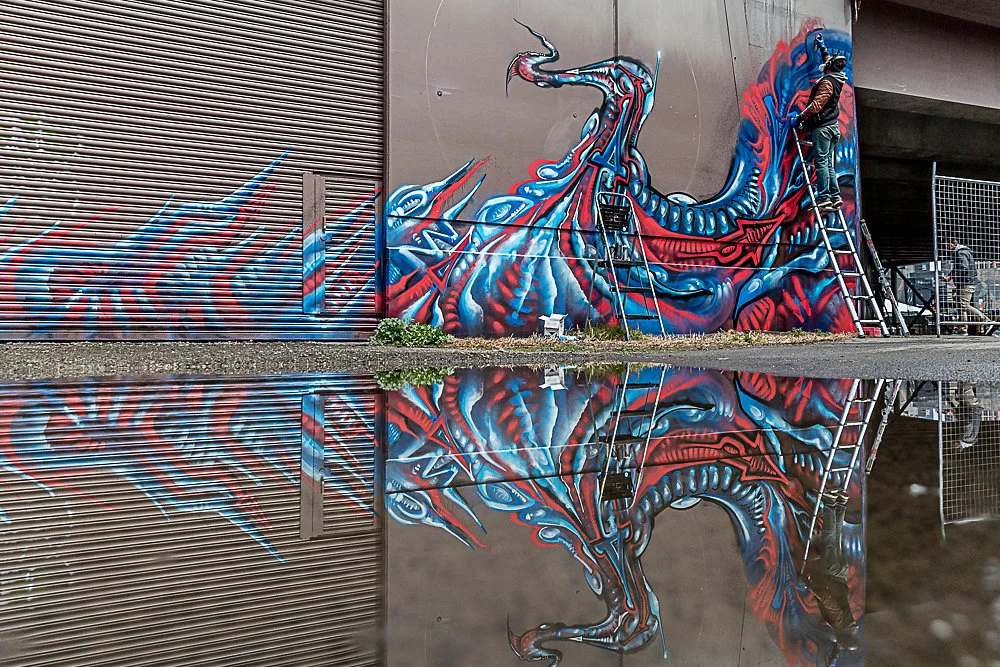
Roughly 40 meters long this piece was commissioned by VicRoads to help brighten an ugly stretch of wall space. Located where Dandenong road crosses the Sandringham train line, near the corner of Chapel street.
Floating | Image captured by p1xels
Roughly 40 meters long, this piece was commissioned by VicRoads to help brighten an ugly stretch of wall space. Located where Dandenong road crosses the Sandringham train line, near the corner of Chapel street.
The concept of the design grew naturally from humble beginnings. This space was a battle ground between graffiti bombers and graffiti cleaners. They would paint it grey then wait for it to get trashed and repeat. As the wall was such a popular canvas for graffiti writers, I thought the best direction to take would be to paint some intricate graffiti pieces. I proposed the idea to Vic Roads that I would select several prominent graffiti artists who were prolific in the area and that together we would paint graffiti pieces from one end to the other. Whilst they liked this concept, they were not yet ready to hand control over to the very artists they had been locked in a battle for space with. They were more interested in getting a single piece of artwork that spanned the length of the wall with continuity of style. To their credit, they gave me a lot of artistic freedom and I really enjoyed painting this piece.
I painted it on my own over a few days. This piece is about movement. The strange dance a graffiti artist performs while standing alone with a brick wall as the audience. Strange glowing forms, that softly float yet aggressively plunge through space at the same time. I have been told by many people that they see dragons in the shapes.

Sinch Station | Balaclava
When the opportunity for an artist to receive a Port Phillip Council grant to paint the 7/11 wall at Balaclava Train Station had been brought to my attention, I instantly thought of my good friend Michael Porter. Mic is one of my favourite artists and a Balaclava local.
Sinch Station | Image captured by p1xels
The opportunity for an artist to receive a Port Phillip Council grant to paint the 7/11 wall at Balaclava Train Station had been brought to my attention. I instantly thought of my good friend Michael Porter. Mic is one of my favourite artists and a Balaclava local. His distinctive style popped up all over Melbourne while he was active in the street art scene. We painted together many times in the early 2000's. Mic started as a typical graffiti bomber like many of the young people in and around St. Kilda. The scene was not a healthy one though, and after a few incidents he pulled back and concentrated on fine art studies at VCA. He developed his own unique style and painted it all over, using found objects and paint collected from hard rubbish. Mic has painted so many amazing pieces in strange and forgotten spaces. I thought it would be perfect for him to paint the wall right at the station to really showcase his talent.
Mic's brother Jordan died at this very station atop a train. His tag “Sinch" is boldly emblazoned on the wall. I felt that this wall needed to be painted by Michael as part of the grieving process and to pay homage to his brother. We focused the design on retaining the Sinch tag and using it as a central feature. The wall depicts a landscape made up of faces with storm clouds rolling in.
“We unfolded the drop sheet and spread it next to the wall and a whole gang of red back spiders scurried out.”
I love Michael's sketchy, painterly style but sometimes the details can get lost in the mottled colours that he uses. I decided to completely control the colour palette and force him to use a really strong graphic combination. He was so eager to get started that he began painting the day before we were meant to begin. I got to the wall and he had begun free-styling - a different work to the design that I had submitted that got us the grant. It was brown and grey and ugly. I could see the nice line work in it, but to someone who doesn't paint it would just look like crazy scrawling. I told him it was good practice but now he had to get stuck into the real thing. We painted for a few days. On day three I placed some drop sheets along the base of the wall. They didn't quite cover the whole length. Mic said not to worry he knew where there was a massive drop sheet then disappeared. He emerged dragging a massive drop sheet that had been alongside the train track for years.
We unfolded the drop sheet and spread it next to the wall and a whole gang of red back spiders scurried out.
"Are you trying to get me bitten again?" I blurted out. I'd been bitten on the leg at the start of the year and didn't want to repeat the experience. Next minute I'm dizzy, my shoulder hurts, my finger is swollen and there is a red line up my arm. Long story short, I had to go to hospital and get my painting finger cut open from knuckle to knuckle and have a sizeable amount of finger removed. Needless to say Mic finished the wall without me.
I have since got him involved in a few other projects and hope to continue to do so as he is an amazing artist.
Underpass Project | CBD
Dean Sunshine organised this big jam of local artists to paint two large sections of wall trackside near Flinders Street station.
Underpass Project | Captured by p1xels
Dean Sunshine organised this big jam of local artists to paint two large sections of wall trackside near Flinders Street station. I organised one side and Dvate was in charge of the other. Was great to get to paint this spot in the day time. It used to have some nice burners on it before the Commonwealth Games million-dollar, grey buffing spree that no one wanted. We had a great line up; Scale, Duke, Mayo, Ling, Ghetto, Putos, Marine, Ghost, Shame and Heesco. All painting really nice work.
I got to do my section with good buddy Mayo. He did one of his signature Caligraffiti Mandalas. His piece was like the setting sun and my graffiti tentacle shape weirdness was curving like a tsunami in front of it. Curling into the centre.
It looks nice from the train.
Image captured by @p1xels
Contrast | St. Kilda
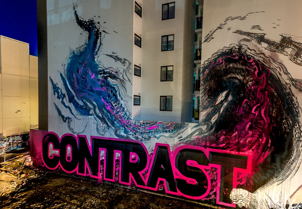
This piece is called Contrast. It is a collaboration that shows the contrast between the super controlled, neat, perfect line work of Luke Presto who did the lettering and my wild, lose, controlled chaos bursting up the wall. My section is painted with fire extinguishers, weed sprayers and rollers.

“This piece shows the contrast between the super controlled, neat, perfect line work of Luke Presto and my wild, lose, controlled chaos bursting up the wall.”
This piece is called Contrast.
It is a collaboration that shows the contrast between the super controlled, neat, perfect line work of Luke Presto who did the lettering and my wild, lose, controlled chaos bursting up the wall. My section is painted with fire extinguishers, weed sprayers and rollers.
The reason we chose the word contrast (apart from the obvious stylistic juxtaposition) is the location. This building is situated on Grey Street, St Kilda. An area renowned for drug addiction and prostitution. These new buildings seem to pop up overnight with not much thought for design, liveability and longevity, let alone for the areas in which they appear.
So we thought it would be ironic to highlight the contrast between those building and profiting from such projects, to the cubicle working and soon to be cubical dwelling yuppies that buy them and the ever widening gap/contrast between the builders/owners and those who have fallen through the cracks. We had many interesting conversations with trans, transient, trashed, tricking types while painting this wall.
Image captured by P1xels
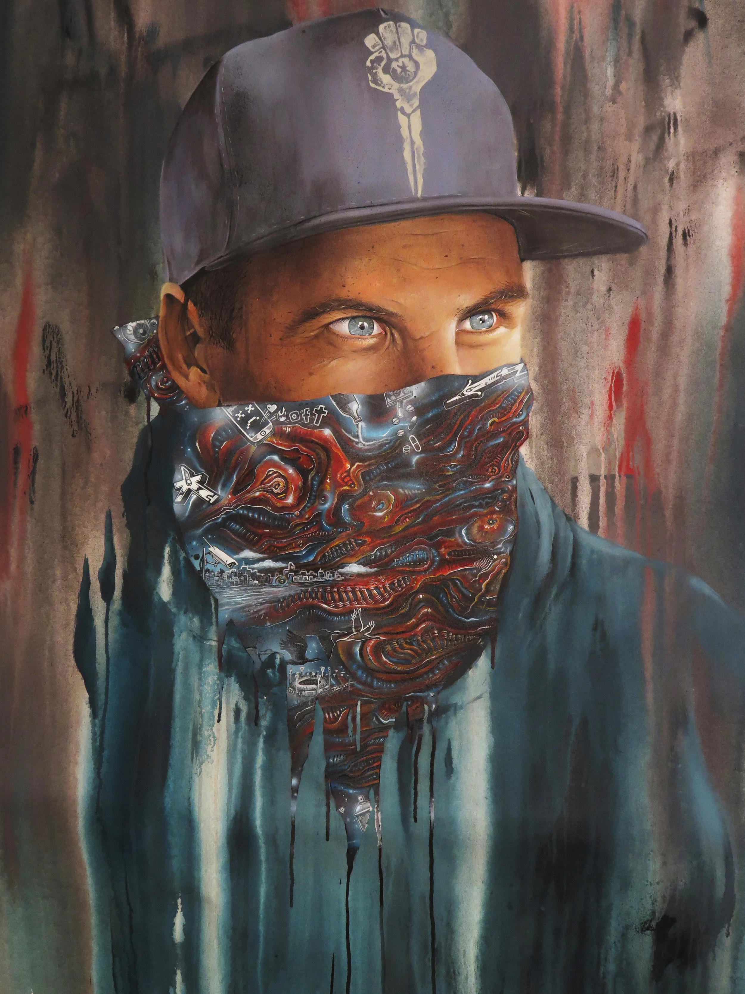
State of Mind | Cam Scale
An exhibition that's an important thread in the fabric of Melbourne's street art culture. The works are portraits of people who play pivotal roles within the scene.

Cam Scale collaboration with Bailer for State of Mind Exhibition.
“State of Mind is an exhibition that captures the thread in the fabric of Melbourne’s street art culture. The works are portraits of people who play pivotal roles within the scene. ”
Cam Scale was painting works for his upcoming show - State of Mind. An exhibition that's an important thread in the fabric of Melbourne's street art culture. The works are portraits of people who play pivotal roles within the scene. Cam has captured the essence and energy of notorious graffiti bombers, famous street artists, tattoo artists, graffiti artists, street art collectors, photographers and graffiti cleaners. This unique take on the scene (turning the lens toward the creators) does not only enthral because of its originality and level of skill, it also has elements of difference in style within each piece. Cam asked each of the artists portrayed to add their own personal touch to their likeness. Many artists including; Anthony Lister, Mayo, Nost and myself have contributed to Cam’s pieces.
The works not only perfectly encapsulate the aesthetic of each artist but are framed with the style, flair and ethos of the artists own hand.
Most of the artists faces are partially obscured, their art almost acting as a barrier between the viewer and the artists’ true identity. This clever technique highlights the fact that the artists are known for their handiwork and more often than not, their true identity’s remain unknown.
Cam asked me if we could collaborate on a piece for his show. He explained the concept to me and I was more than happy to be involved. We have been painting murals together for years, and have shared art spaces at Blender and Juddy Roller. I no longer have a space there, so I dropped in and he took some photos so he could get painting. He always begins by layering up the background with texture and drips then goes to work on the face. When he'd completed the portrait, he masked off the face and areas he didn’t want me to get paint on then delivered the painting to my place. I had seen a picture of the piece before he masked it all off and it was impressive. I wanted to do it justice so I put in some hours. I think I spent five nights in a row painting in my favourite blue and red on black.
I didn’t want to depict anything, just abstract, surrealist, biomechanical landscapes.
I figured the portrait was ultra-realistic, so I would juxtapose the smooth subtle skin tones against the strange imagined shapes. I thought I'd finished, but staring at the painting I decided that it needed more. As it's a portrait, I figured it wouldn’t hurt to have a few elements that represent parts of my psyche.
I did these in grey scale to separate them from the abstract forms, as though the strange twisted red and blue shapes were my brain and these were ideas. Elements of graffiti, the city, CCTV surveillance, social media gone crazy, drugs and alcohol being poured out (I had remained five months sober at this point) just a few things that mould the young mind. The exhibition was a success, many people came and Cam sold quite a few paintings. I was in hospital at the time of the opening but Dean Sunshine drove down and helped me make a getaway to check out the paintings before returning to the hospital bed to recover.

Elephant Mural | Abbotsford
Painted at the rear of 4 Thomson St. in Abbotsford, this massive mural was the brain child of Mike Makatron from the Everfresh Crew.

I've know Mike for many a year - we've painted and partied together on many occasions. Makatron is a legend. He seems to know everybody, everywhere you go.
It had been a while since we'd painted together and I don't think we've ever done anything of this scale with just the two of us. His friend was renovating a house that he had bought and wanted something from the psychedelic world inside Makatron's mind to decorate the brick wall.
Maka had a plan to paint a city on the back of a steampunk/robot elephant walking through water. He wanted me to add some plant life in my signature style. This was no problem for me as painting some twisted tentacle tree root is just as fun for me as painting a piece. I kind of treat the image as though it's graffiti without letter form; still giving it the same kicks and arrows I would a normal graffiti piece.
The thing that makes this mural so effective as a whole is the colour change up. Everything below the water line is painted in a darker version of the aqua colour used to paint the water. No black - apart from a little transparent. Maka is great with colours so I just got to work filling in.
The mural only took us a couple of days. One to prep, buff the wall and sketch up the design and another to get stuck into it. It was great painting with Maka, we have a very similar approach when tackling large scale murals. Hopefully we can do something bigger and better together this year.
Image captured by p1xels.
“I treat the image as though it’s graffiti without letter form; still giving it the same kicks and arrows”

The Tiger Mural | St. Kilda
I selected this wall for a few reasons; it's located in the heart of St. Kilda in the carpark on Irwell Street just off Acland Street. It's a flat, large space with no windows. The colour and texture of the brick surface was so nice I thought we could leave some of it showing as part of the mural. We were handed a few simple guidelines but were basically given Carte Blanche when coming up with the design.

The City Of Port Phillip was kind enough to provide Conrad Bizjak and myself with the opportunity to paint this mural. I selected this wall for a few reasons; it's located in the heart of St. Kilda in the carpark on Irwell Street just off Acland Street. It's a flat, large space with no windows. The colour and texture of the brick surface was so nice I thought we could leave some of it showing as part of the mural. We were handed a few simple guidelines but were basically given Carte Blanche when coming up with the design.
The concept of the design grew naturally from humble beginnings.
I roughly sketched out a tidal wave made up of graffiti elements; chrome arrows, splashes and drips. Conrad thought to add a tiger jumping with the flow of the water, parts of the body and head repeated to denote movement. We decided that one clear tiger would have more impact visually. Especially if we gave it a dark edge to pop it off the chrome moon. The chrome shapes have been a recurring motif in many of my recent murals. Using shiny chrome and incorporating arrows and other elements from the graffiti world into my mural artworks is basically paying homage to the art-form that impassioned and shaped the trajectory of my life.
I don't want to forget the culture that hs taught me so much, but i also no longer wish to stay moored to its conventions.
Graffiti seems to have many parameters. I hope to push through these barriers while still retaining a glimmer of my artistic origins and graffiti style. Once we had the composition mapped out we started to add more meaning to the image.
We mused that perhaps the tiger could represent the modern media pouncing on a story, keen to sink its teeth in.
Conrad replaced the tigers head with a camera (a motif that often appears in his canvas work). This created an interesting dynamic of old and new. What had been a natural scene of a tiger running through crashing waves, was now more sinister. An image that could have been from a Japanese woodcut but with a twist of technology - albeit outdated.
Thi retro camera highlighting the fact that television media companies are sprinting to keep up with reporting the "news" but are somewhat slipping into obscurity, as people look elsewhere to stay informed.
We started painting early June 14th. Conrad is good to paint with; a hard worker who understands what needs to be done and gets to it. We both worked simultaneously on sections of the wall stopping occasionally to discuss the progress. Thanks to the generosity of The City of Port Philip we had access to a scissor lift, which made the painting process far easier than it would have been without.
All up, the mural took us three days to paint.
It wasn’t until the final evening that we came up with the painting’s protagonist. We were spraying a beam from the front of the video camera/head. As we stood back to admire our handiwork Conrad thought it looked like a beam of light. I thought it might be nice to aim this spotlight at something. A small fishing boat caught in a tumultuous tide. The irony that the beam of light normally emanating from a light house that would lead a sailor to safety, in this instance shone from the hungry features of a giant beast wanting nothing more than to feast on the story. Whipping its viewers into frenzy about a tiny boat, adrift in a sea of ignorance. The passengers aboard this meagre vessel are not shown, as unlike the media. we will leave it to the viewer’s discretion to decide what the story is.
“I WANTED TO CREATE A LARGE SHAPE THAT HAD POWER AND MOVEMENT”